
Here I am looking at different magazine front covers, contents page and double page spread. I will give my opinions on them also these magazines would be used as inspiration for mine. The magazine will all be featuring artist within the genre that I am studying.
FRONT PAGE

I like the position of this front page because the main subject is looking at the camera also the background is very urban.
|

I like the camera shot used to take it this front cover as his face is what you see first.
|

What i like about most on this front cover is that the colour scheme is mainly back and white however, the cover-lines and masthead is not making it stand out more.
|

What I like most about this front cover is the camera angle and how the cover like are in a perspective that makes it look more 3-D and interesting.
|

I like this front cover as it is simplistic and a part of the the main image is off the page.
|
CONTENTS PAGE

what I like about this contents page is the layout and font font used for the as the page number is big & funky. |

I like the colour of the background which is black making it appear more bold also it features a large image to catch the viewers eye more. |

What i like most about this contents page is that the images are cut out and laid out like a montage of pics & the text around it.
|

I like the colour scheme used on this page and the background as it is unique.
|

What I like most about this contents page is that it's clear this would be important when designing my contents page is so that they can read it. |
DOUBLE PAGE

I like the layout and font used on this page as it place at the top of the right hand page on the left page is the main image which is big and eye-catching.
|

I like this page, as the colour scheme with different shades and how the masthead of this page overlaps the main image.
|

What I like abut this page is the text and how it is placed also the circles around it are interesting.
|

What I like about this double page similarly to the others the main image takes up one side of the page. I also like how the masthead is in the same colour as the main image making it flow.
|

I like how the name of the main i,age is overlapping it. This is effective because it makes it clear who this page is about. Also the main image becomes the background of this page. |
genre SPECIFIC poses & costume
Poses

This picture of Drake the chains and hand gesture would suggest he is cool, rich and laid back

This picture of Justin Timberlake with his hands in this pockets leaning against the wall would portray him a very chilled out guy. Much like the music genre.
|

This picture of Rihanna she has a menacing facial expression and a toothpick in her mouth. This make her seem like a rebel

Chris Brown's body language would suggest he is a menacing and confrontation person also it could suggest he has pride.
|

This picture of The weeknd he is facing down although, we cannot see what he is looking at he appears to be cool.

This picture above is of Tyga his hand gestures would suggest he is ruthless and has a gangster persona. This infers that he is tough.
|

This picture of Cassie she is turned to the side and is looking at the camera this pose would suggest she is chic and fashionable.

This picture of Jhene Aiko her hand gestures connote that she a peaceful and placid person and her facial expression is warming. This fits within the genre as RnB music can be an outlet for stress.
|
All of these artist can be classified as R&B they are looked up to in terms of their career the music they make; what they say etc. They influence the younger generations in good or bad way just depends on what you with. Some of these artists in this genre are controversial.
costumes and fashion styles

This is Usher an RnB artist as you would probably know. He is wearing a fairly large chain, pair of sunglasses and a leather jacket. He likes to wear jewellery as he is popular to show he is admired.

This picture above is of Kanye West his clothing would suggest he is a very trendy person. His scarf is bright and funky much like his sunglasses.
|

Here we see a picture of Nelly, he is wearing a vest, chain and sunglasses. As his arms are exposed he is hows how muscular and well built. This influence younger generations as he is showing off and they would need to be like him to fit in society.

This picture above of Tyga his clothes are littered with shiny gold parts this would portray him as very glamorized.
|

This picture of Tinashe she is wear a basketball tee and a bandanna around her head. She is hipster and trendy.

This picture above of Justin Bieber his chain, black glasses and baggy top would suggest he is cool and poised.
|
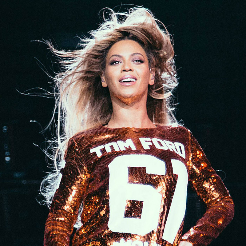
This photo of Beyonce reflects her genre well because she is wear a sequin jumper with large urban font

This picture above is of Asap Rocky this costume would infer he is hipster and has a lot of dignity.
|
InTERVIEW


These are my hand drawn drafts. I made sure the main image is the biggest and have the main cover-line be the largest this will make it eye-catching and clear to the viewer who is is about.

For my first contents page draft I decided to make the masthead the feature of the page to do this it would need to be the biggest image, however I would need to feature other subjects on my this page so in my next draft I made it feature multiple images.

For this draft i decided to position the main image in the middle to that when the view looks at this page it is hard to avoid.

Here for this draft the text would flow onto the other side of the double page making the main image more integrated with the text.
|

For these drawn drafts of my front cover. I opted for a bright background to make the main image stand out more.

Here is another contents page layout i decided to go for the more uniformed look for one and the other would have a different composition than normal by having the Masthead in the middle of the page

For this double page I decided to use a drop capital at the start of the extract combined with a large masthead image the background of the image would flow between both sides of the page. 
For this double page similarly to the others i decided to make the pull out quotes a different colour.
|

front cover
For my digital drafts I used photoshop to create. Both draft front covers include the essential conventions. I decided to also integrate the colour scheme of my magazine which is blue, black and purple. I choose the main image to have a mid shot, in my opinion this is more appropriate for the front cover.
contents page |

This is another digital draft it is an alternative way my front cover could be layout. My second draft like the first still consists of the same colour scheme. I chose a long shot to be used for the main image as it allows the viewer to see the whole costume.
|

For this contents page i have stuck with the same colour scheme. I strived for a formal and simplistic layout. It includes the majority of conventions
double page spread
My double draft also features the same colour scheme as the rest. It includes conventions such as main image subject name, headline etc. I opted for the main image to be centred in the middle this allows the viewer to know exactly who is it about.
|

Similarly to my first contents page layout by having the same colour scheme and layout i decided to alter the composition of the title by having it run along the side of the page. This would make the page more eye-catching.

However on this double page the main image would be placed on the right hand side taking up one a4. Here the pull out quote is placed in between the columns and the image as it would be in a different typography
|


In this section we have to take pictures for our music magazine,I decided to have my pictures in a very urban setting as that would flow with the RnB genre that my music magazine is going to be about. I will also practice various different shots such as, close up, mid, low angle etc.
front page |
contents page |
double page pictures

I like the angle used when taking this picture, although the quality may not be the best. The low shot angle makes it look more menacing, that's why i like it. This picture was taken as I experimented with angles to see which one will look best.
|
I used a Fujifilm Finepix S Series S3290 digital camera similar to the camera tested at college to take pictures. The 14.0 mega pixel allowed me to take high resolution pictures. I practised getting the correct shots that where appropriate for the subject and where it would go in my magazine.
I learnt and was taught a good technique by pressing down softly on the aperture button allowed the camera to focus in on the subject then press down as a result, this produced better pictures in my opinion capturing more light and detail. As the pictures I took were outside I decided to put the camera in automatic shutter speed this helped reduce the chance of blurring due to movement and over-exposed colours. I would also be using photo-shop to edit my pictures and make minor changes such as the hue and saturation to get different effects and a few filters. 
What I like about this photograph is that I used to appropriate shot which is a wide shot because it captures all of the people. I also like how each person is doing a different action and looking in different directions this makes the image more interesting and eye-catching for the viewer.

What i like most about this picture is that the background is graffiti. The reason why I chose this background is because it would reinforce what the magazine is about also a two shot is used to capture both of the people.
|


skills log
In this section I learnt how to create my digital drafts using vectors in photoshop and laying them out neatly using rulers and a grid furthermore, layering the vectors correctly in photoshop to make it look professional was simple yet a tedious process. I also reinforced my understanding of different camera shots when taking pictures for my music magazine I figured out how to use a digital camera to my benefit.
Final designs
Front page

This is the digital draft I'll try and base my front cover off.
|

|

The first thing i did was get rid off the the original background and replace it with this gradient.
|

In the next stage I used "Sprace Craft" font for the masthead and multiplied it and merged it together to get that effect. I also began adding cover line, competitions & bar code.
|

This is my final front cover I am pleased with it, I added more cover lines another type of bar code the website address etc. I also experimented with different colour shades.

|

This is my start to the contents page. I soon realised that my template for this page isn't suitable as it would look cluttered
|

I started to add in pictures trying to figure out a good composition to work from and where the text would go.
|

Here i figured out a good way my contents page should be laid out so that it looks neat and i started to develop further.
|

This is the final design for my Contents page i decided to simplify my colour scheme and also make sure that it flowed with the rest of my magazine.

|

Here I started to look at ways that my double page could be laid out. I wanted to use a limited range of colours.
|

Here added a picture however, I am not sure about it. I continued to develop my double page adding all the essential conventions
|

Here I changed the image making this image is more interesting as it is a low angle. Using guides allowed me to make sure it is laid out accurately.
|

Here I change the layout slightly as there were a few gaps which looked like wasted space. I added another convention which is a stand first.
